July 22, 2026
- AI Technology
- Interior Design
Why Paint Swatches Lie: Test Color in 3D First | VirtualSpaces
Hemanth Velury
CEO & Co-FounderWhy Paint Swatches Lie, and How Testing Color in the Real Room First Changes the Choice
Everyone has done the ritual. You bring home a fan of paint chips, tape a row of them to the wall, and stand there in the afternoon squinting. You narrow it to three. You buy sample pots, paint three sad little squares near the window, wait for them to dry, and squint again. You pick one. You paint the whole room. And half the time, the color that looked perfect on the chip looks wrong on the wall. Too dark. Too cold. Too much green in it that you would have sworn was not there in the store.
That is not bad luck, and it is not a bad eye. The swatch was always going to mislead you. A small, printed chip held in your hand tells you very little about how a color will actually behave across a whole room. This post is about why that happens, and about a better way to decide: one where you see the color in the actual room, at full size, in the room's own light, before you buy a single can.
A swatch is not the color
Start with the uncomfortable truth. The chip in your hand and the wall in your room are two very different things, and the gap between them is where mistakes live.
A paint color is not a fixed fact. It is a performance, and the performance depends on the stage: the size of the surface, the light in the room, the colors around it, and the finish it is painted in. Change any of those and the color changes with it. The chip strips all of them away. It shows you a two-inch rectangle of printed ink, on a bright white card, under store lighting. Almost nothing about that matches the wall you are actually trying to paint. You are being asked to make a permanent decision from a sample that removes every variable that decides the outcome.
Why the swatch lies
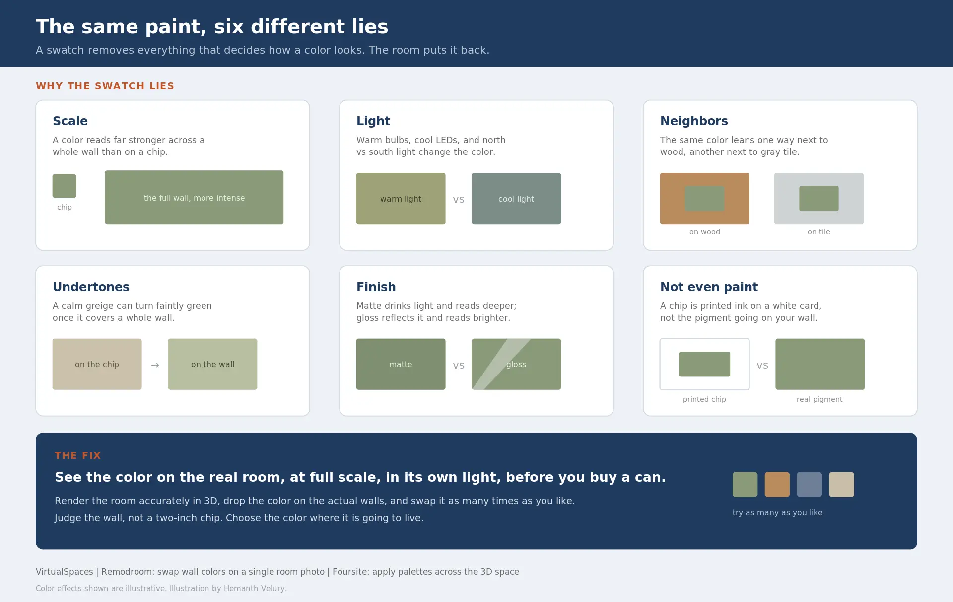
Here are the specific ways a swatch misleads you, and the trouble is that every one of them is working at the same time.
-
Scale changes everything. A color gets more intense as it gets bigger. A soft gray on a chip can read as a heavy, cold slab across a full wall. A cheerful yellow can turn into something that hums in your eyes. Painters and designers learn to expect a color to look a couple of shades stronger at full size than it did in the hand. The chip is the one size the color will never actually be in your home.
-
Light rewrites the color. The same paint looks like a different color in daylight, under warm bulbs, and under cool LEDs. A north-facing room pulls colors cooler and grayer. A south-facing room warms them up. Morning light and evening light disagree with each other on the same wall. There is even a named trap for this: metamerism, where two colors match perfectly under one light and clearly do not under another. You approve a color under the store's lights and carry it home to a room whose light was never in the conversation.
-
The colors around it shift what you see. No wall exists alone. Your eye judges a color against everything next to it: the floor, the sofa, the trim, the wall it turns a corner to meet. Put a beige next to warm wood and it leans pink. Put that same beige next to cool gray tile and it leans green. This is not your imagination playing tricks. The artist Josef Albers built a classic book, Interaction of Color, around exactly this: a color's appearance is bent by its neighbors. A chip on a white card has no neighbors, so it hides the one thing that matters most in a furnished room.
-
Undertones stay hidden until it is too late. Grays, whites, and greiges all carry undertones: a whisper of green, blue, pink, or yellow underneath the main color. On a small chip that whisper is inaudible. Across a whole wall, in the room's own light, it can become the loudest thing in the space. The number of people who chose a calm "greige" and ended up with a faint hospital green is not small, and none of them saw it coming on the chip.
-
Finish changes the read. The same color in matte and in gloss are not the same experience. Sheen reflects light, so a glossy finish looks lighter and brighter and shows every bump in the wall. A flat finish drinks the light and reads deeper and softer. The chip is usually a flat print, so it tells you nothing about what your eggshell or your satin will actually do once it is up.
-
A printed chip is not paint. This is the quiet one. The swatch is printed ink doing an impression of pigment. It is a decent guess, not the real material, and the small format plus that bright white border nudge your eye even further off. In the end, you are choosing paint by studying a small photograph of paint.
Put all of that together and the honest conclusion is simple. The swatch is not lying to be cruel. It just cannot carry the information you need, because the information lives in the room, not in your hand.
The usual fixes help, and still fall short
Good painters and designers already know the chip is weak, so they reach for better tools. Those help. None of them closes the gap.
Sample pots and painted patches are the classic move, and they are a real improvement. You get true pigment, at a bigger size, in the actual room. But they are slow and messy. Two coats, drying time, often several days once you are testing a few options at once. You are also judging a small square surrounded by the old wall color, which quietly drags your perception in the wrong direction. And you still have to imagine the finished room, furniture and all, because none of it is there yet while you stare at the patch.
Peel-and-stick samples are tidier, and better than a chip. They are still small and still missing the room's full furnishings and light doing their work across an entire wall.
All of these share the same limit. They test the paint. They cannot test the room. And the room is the actual question you are trying to answer.
The cost of guessing wrong
It is worth being honest about what a wrong color actually costs, because it is more than a can of paint. It is the primer, the second coat, and the hours or the labor to redo a whole room. It is the delay on a project while everyone waits to repaint before the furniture moves in. For a designer, it can be an uncomfortable conversation and an unpaid revision. For a homeowner, it is a weekend, or a hired crew, spent fixing a decision that felt safe on the chip.
None of that spend produces anything new. It just buys back the mistake. And almost all of it traces to the same root: a choice made from a sample that could never show the real result.
Test the color in the room, before you buy
Here is the shift. What if you could see the color on the real room, at full scale, on the actual walls, in the real light, next to the real furniture, and change it as many times as you liked, before buying anything?
That is what AI visualization makes possible now. Instead of guessing from a chip, you look at your room, rendered accurately in 3D, with the color on the walls, and you judge the thing itself. Not a two-inch approximation. The wall. Because the render is spec-accurate, the color sits on real surfaces at real scale, wraps the corners the way it will in life, and meets the floor and the furniture it will live beside. You can swap to another color in a second and compare. You can look at the warm option and the cool option side by side instead of holding two chips and glancing back and forth.
For most people the useful part is speed and honesty at the same time. You can try fifteen colors in the time it used to take to tape up three, and every one of them is shown on your real room instead of in your head. This is one of the most practical uses of AI interior design today. It is not about inventing a fantasy room; it is AI 3D visualization aimed at a small, real question: what will this color actually do here, before I commit to it?
How it works, in practice
Two tools from VirtualSpaces do this from different starting points, and both run on the same accurate 2D to 3D engine.
Remodroom is the homeowner's door. You upload a single photo of your room and swap wall colors and finishes on your actual space, then see the result as a photoreal image. The green you were nervous about is right there, on your wall, next to your couch, in your light. If it leans the wrong way, you change it and look again. No pots, no drying, no repaint, and no committing to a color you have only ever seen on a card. It is AI interior decor decided by looking, not guessing.
Foursite is the designer's and developer's door. It converts a floor plan to 3D, turning 2D floor plans and blueprints into a spec-accurate 3D interior, then lets you apply custom color palettes and a full material and paint library across the whole space. A designer can present a client three completely painted schemes on the real room, as photoreal interior design renders and virtual staging, instead of a mood board and a promise. A developer can set a palette across model units and see it applied consistently before a single wall is rolled.
Both are the same idea aimed at different people: see the color in the room before you commit to it.
What changes for whom
The payoff is not just a prettier picture. It is fewer expensive mistakes and faster, calmer decisions.
-
For homeowners. The most common repaint is the one that follows a color that looked right on the chip and wrong on the wall. Seeing it first, on your own room, is how you skip that repaint entirely. You choose with your eyes instead of your nerves, and you live with the result instead of redoing it.
-
For designers. Color is where a lot of client anxiety lives, and where a lot of revisions are born. Showing a client the actual room in the actual color turns a nervous back-and-forth into a quick, shared decision. Sign-off comes sooner, and the change that used to mean another sample round and another few days becomes a swap you make together on the screen.
-
For developers. Consistency and speed. Set a palette, apply it across floor plans, and see every unit in it before committing paint orders across an entire project. The mistakes that are expensive at the scale of one room are far more expensive at the scale of a building.
Color is just the first domino
Color is one decision, but it is the pattern for all of them. Flooring, tile, cabinet finish, countertops: everyone is a small color-and-material choice made today, usually off a sample too small to trust, for a room that does not exist yet. The same fix applies to all of them. When the room is visible and accurate, you stop deciding blind and start deciding by looking. Paint is simply the easiest place to feel the difference, because nearly everyone has been burned by a swatch at least once, and remembers it.
The swatch had a good run
For a hundred years the paint chip was the best tool we had, and it was never good enough. It shows you the wrong size, in the wrong light, without the room, on the wrong material. Of course it lies. It was built to fit in a fan deck, not to tell the truth about your living room.
The real test was always the room itself. Now you can see the room first, with the color on it, before you buy a can or lift a brush. Choose the color there, where it is going to live, and the choice stops being a gamble and starts being a decision you can actually see.
Recommended for you

August 19, 2026
The End of the Model Home? 3D Changes the Math | VirtualSpaces
HHemanth Velury
CEO & Co-Founder
August 17, 2026
Designing Spaces That Actually Get Built | VirtualSpaces
HHemanth Velury
CEO & Co-Founder
August 12, 2026
Designing Homes for the Stuff People Actually Own | VirtualSpaces
HHemanth Velury
CEO & Co-Founder
August 07, 2026
Floor Plan to Bill of Materials: The 3D Model as Data | VirtualSpaces
HHemanth Velury
CEO & Co-Founder.png&w=1080&q=75)
August 05, 2026
Designing Homes for How People Actually Live | VirtualSpaces
HHemanth Velury
CEO & Co-Founder
August 03, 2026
Honest by Design: Trust in AI Real Estate Imagery | VirtualSpaces
HHemanth Velury
CEO & Co-Founder
July 29, 2026
Kitchen and Bath: The Two Rooms That Decide Resale | VirtualSpaces
HHemanth Velury
CEO & Co-Founder
July 27, 2026
Why Empty Rooms Don't Sell: Virtual Staging | VirtualSpaces
HHemanth Velury
CEO & Co-Founder
July 24, 2026
The Quiet Sustainability Win of Deciding in 3D | VirtualSpaces
HHemanth Velury
CEO & Co-Founder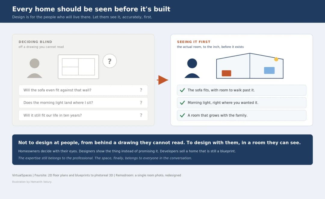
July 20, 2026
Why Every Home Should Be Seen Before It's Built | VirtualSpaces
HHemanth Velury
CEO & Co-Founder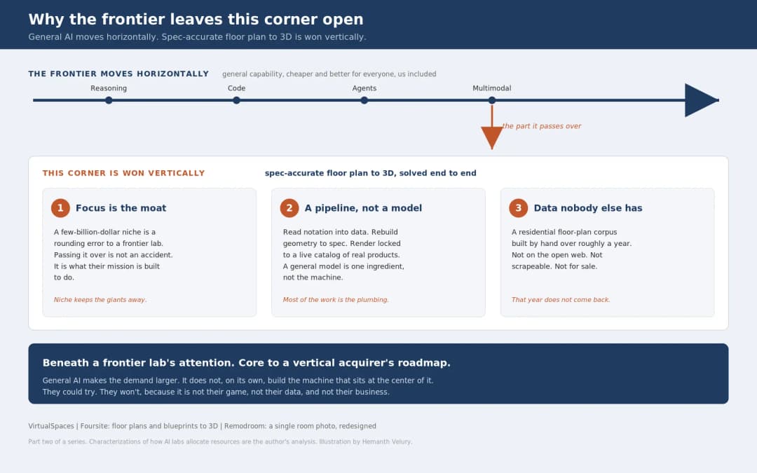
July 17, 2026
Why Big AI Labs Won't Build Floor Plan to 3D | VirtualSpaces
HHemanth Velury
CEO & Co-Founder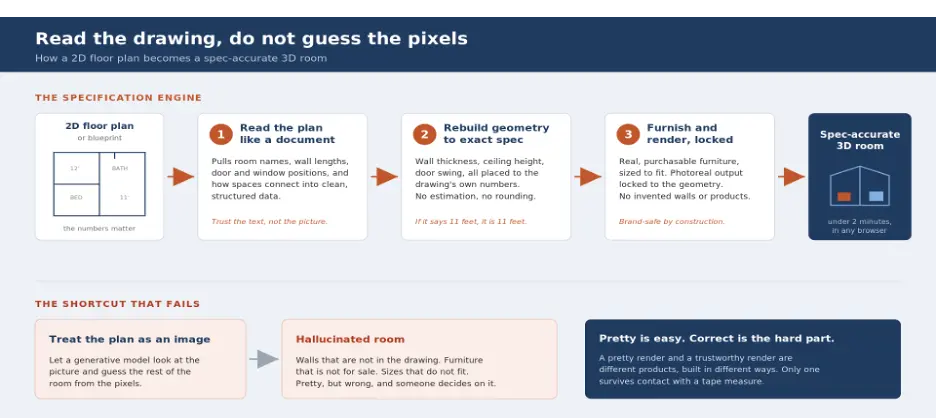
July 15, 2026
How We Solve Floor Plan to 3D, Accurately | VirtualSpaces
HHemanth Velury
CEO & Co-Founder
July 13, 2026
Designing Homes That Age With the People in Them | VirtualSpaces
HHemanth Velury
CEO & Co-Founder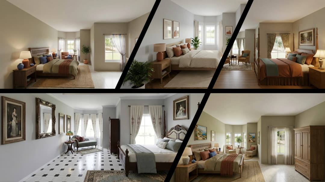
July 10, 2026
Designing Spaces for How Light Actually Moves | VirtualSpaces
HHemanth Velury
CEO & Co-Founder
July 08, 2026
Designing Homes for Every Life Stage in 3D | VirtualSpaces
HHemanth Velury
CEO & Co-Founder
July 06, 2026
Build an Interior Design Portfolio Without Clients | VirtualSpaces
HHemanth Velury
CEO & Co-Founder
June 26, 2026
AI Interior Design: Full 3D Workflow in One Platform | VirtualSpaces
HHemanth Velury
CEO & Co-Founder
June 24, 2026
Scope Creep in Interior Design: How AI Visualization Fixes It | VirtualSpaces
HHemanth Velury
CEO & Co-Founder
June 22, 2026
What Buyers See on a Floor Plan: Your Biggest Sales Problem | VirtualSpaces
HHemanth Velury
CEO & Co-Founder
June 19, 2026
Small Design Studios vs Big Firms: The AI Advantage | VirtualSpaces
HHemanth Velury
CEO & Co-Founder
June 17, 2026
After the Mood Board: AI Interior Visualization | VirtualSpaces
HHemanth Velury
CEO & Co-Founder
June 15, 2026
Foursite Pro Editor: Full Floor Plan Control for Designers | VirtualSpaces
HHemanth Velury
CEO & Co-Founder
June 12, 2026
AI Interior Design: Style Any Room in Seconds with Foursite | VirtualSpaces
HHemanth Velury
CEO & Co-Founder
June 10, 2026
Foursite: Floor Plan to 3D Walkthrough in Minutes | VirtualSpaces
HHemanth Velury
CEO & Co-Founder
June 08, 2026
Win More Pitches With AI Renders Before the Meeting | VirtualSpaces
HHemanth Velury
CEO & Co-Founder
June 05, 2026
From Floor Plan to Finished Room: What AI Now Makes Possible | VirtualSpaces
HHemanth Velury
CEO & Co-Founder
June 03, 2026
The Interior Design Brief Is Broken. AI Fixes It | VirtualSpaces
HHemanth Velury
CEO & Co-Founder
June 01, 2026
Pre-Construction Home Sales: AI Interior Visualization Guide | VirtualSpaces
HHemanth Velury
CEO & Co-Founder
May 30, 2026
Interior Design Principles: Applied with AI | VirtualSpaces
HHemanth Velury
CEO & Co-Founder
May 28, 2026
Designing Spaces for People, Not Blueprints | VirtualSpaces
HHemanth Velury
CEO & Co-Founder
May 26, 2026
The Future of Interior Design: Closing the Visualization Gap with Foursite and Remodroom | VirtualSpaces
HHemanth Velury
CEO & Co-Founder
May 18, 2026
How AI Visualization Upgrades Property Data Platforms | VirtualSpaces
HHemanth Velury
CEO & Co-Founder
May 14, 2026
How AI-First Insurers Can Use 3D Property Data to Transform Home Claims | VirtualSpaces
HHemanth Velury
CEO & Co-FounderMay 12, 2026
Why Photoreal 3D Renders Are Replacing Mood Boards | Interior Design Client Presentations | VirtualSpaces
HHemanth Velury
CEO & Co-Founder
May 08, 2026
From 2D Floor Plans To Living Worlds: The Spec‑Accurate 3D Engine | VirtualSpaces
HHemanth Velury
CEO & Co-Founder
May 06, 2026
Why Furniture Brands Need AI 3D Visualization Now | VirtualSpaces
HHemanth Velury
CEO & Co-Founder
May 4, 2026
How Property Portals Can Turn 2D Floor Plans into 3D Design Decisions | VirtualSpaces
HHemanth Velury
CEO & Co-Founder
April 29, 2026
The Home-Fit Test: Why Square Footage Misleads | VirtualSpaces
HHemanth Velury
CEO & Co-Founder
April 27, 2026
Designing Homes That Sell: 3D Visualization ROI Data | VirtualSpaces
HHemanth Velury
CEO & Co-FounderApril 24, 2026
What's Next: Foursite & Remodroom's New AI Features | VirtualSpaces
HHemanth Velury
CEO & Co-Founder
April 22, 2026
AI in Architecture: Closing the 85% Exposure Gap | VirtualSpaces
HHemanth Velury
CEO & Co-Founder
April 20, 2026
Interior Design Pricing in 2026: From Hourly to Value-Based Fees | VirtualSpaces
HHemanth Velury
CEO & Co-FounderApril 17, 2026
How Foursite and Remodroom Help Designers Win Clients | VirtualSpaces
HHemanth Velury
CEO & Co-Founder
April 15, 2026
Designing Spaces for People: Remodroom + Foursite AI Guide | VirtualSpaces
HHemanth Velury
CEO & Co-Founder
April 13, 2026
Designing for the Way People Actually Live: How AI 3D Is Finally Closing the Gap Between Floor Plan and Reality
HHemanth Velury
CEO & Co-Founder
April 11, 2026
Design in Real Time: AI Renders in Your First Client Meeting
HHemanth Velury
CEO & Co-Founder
April 06, 2026
Why Real Estate Photography Is No Longer Enough: The Shift to Spatial-First Listings
HHemanth Velury
CEO & Co-Founder
April 03, 2026
Property Management's Hidden Weapon: AI 3D Floor Plans That Cut Vacancy Time and Raise Tenant Quality
HHemanth Velury
CEO & Co-Founder
April 01, 2026
Off-Plan and Oversubscribed: How AI 3D Visualization Is Transforming Real Estate Pre-Sales
HHemanth Velury
CEO & Co-Founder
March 30, 2026
Why Foursite Beats Generic AI Tools for Interior Design 3D Visualization
HHemanth Velury
CEO & Co-Founder
March 27, 2026
7 Tenets of Interior Design: How AI Accelerates Harmony in Residential Spaces
HHemanth Velury
CEO & Co-Founder
March 25, 2026
What Is the 3-5-7 Rule in Interior Design? Foursite's AI Guide for Residential Spaces
HHemanth Velury
CEO & Co-Founder
March 23, 2026
What Is the 70/30 Rule in Interior Design? Foursite's AI Guide for Residential Spaces
HHemanth Velury
CEO & Co-Founder
March 20, 2026
How AI 3D Visualization Is Rewriting Residential Interior Design Workflows
HHemanth Velury
CEO & Co-Founder
March 18, 2026
Beyond Marketing: How 3D Floorplans Transform FM, Retrofit Planning & ESG Operations
HHemanth Velury
CEO & Co-Founder
March 16, 2026
Why AI Companies Use Token Payments (And Why VirtualSpaces Is Returning To Fiat)
HHemanth Velury
CEO & Co-Founder
March 13, 2026
Floorplan‑Native Digital Twins: Beyond BIM for Consumer‑Ready Real Estate Experiences
HHemanth Velury
CEO & Co-Founder
March 11, 2026
The Foursite Platform Thesis: Why Floor Plans, Not Photos, Are the Next Property Software Primitive
HHemanth Velury
CEO & Co-Founder
March 09, 2026
Design Systems for Space: Building Reusable 3D Component Libraries on Top of AI Floorplan‑to‑3D Engines
HHemanth Velury
CEO & Co-Founder
March 06, 2026
How to Standardize Design Quality Across Global Projects Using AI Floorplan-to-3D Tools
HHemanth Velury
CEO & Co-Founder
March 04, 2026
From CAD-First to AI-First: Reskilling Your Team for AI-Native Design Workflows
HHemanth Velury
CEO & Co-Founder
March 02, 2026
Algorithmic Ergonomics Meets Photorealistic 3D: Designing Human-Centered Smart Homes with Foursite in 2026
HHemanth Velury
CEO & Co-Founder
February 27, 2026
The Ethics of AI in Interior Design: Ownership, Originality, and Client Transparency
HHemanth Velury
CEO & Co-Founder
February 25, 2026
Designing with Empathy: Using AI 3D Visualization to Improve Client Communication and Emotional Clarity
HHemanth Velury
CEO & Co-Founder
February 23, 2026
From Tool to Infrastructure: AI Floorplan-to-3D and the Next Wave of PropTech
HHemanth Velury
CEO & Co-Founder
February 20, 2026
AI Interior Design for Holiday Homes: Turn Spare Flats into High-Demand Short-Stay Rentals with 3D Visuals
HHemanth Velury
CEO & Co-Founder
February 18, 2026
The Pre‑Purchase Power Play: How Savvy Home Buyers Use 3D Floor Plan Visualization to Negotiate Better Deals
HHemanth Velury
CEO & Co-FounderFebruary 16, 2026
AI Interior Design for Non‑Designers: How Homeowners Can Brief Like Pros
HHemanth Velury
CEO & Co-Founder
February 13, 2026
Scaling a Design Business Without Hiring a 3D Team: An Owner's Guide
HHemanth Velury
CEO & Co-Founder
February 11, 2026
From Bland to Bold: How to Rescue Builder-Grade Interiors on Any Budget
HHemanth Velury
CEO & Co-Founder
February 6, 2026
The Psychology of Space: How Room Dimensions Influence Interior Design Decisions
HHemanth Velury
CEO & Co-Founder
February 4, 2026
The Future of Interior Design Visualization: How AI Technology is Transforming 2D Concepts Into 3D Reality
HHemanth Velury
CEO & Co-Founder
February 2, 2026
AI Interior Décor: How Artificial Intelligence Generates Design Options from Your Floor Plan
HHemanth Velury
CEO & Co-Founder
January 30, 2026
Photoreal vs. Reality: What Clients Actually Expect from Interior Design Visualization
HHemanth Velury
CEO & Co-Founder
January 28, 2026
The Design Approval Conversation That Changes Everything: Communication Strategy When Using Photorealistic Visualization
HHemanth Velury
CEO & Co-Founder
January 25, 2026
Interior Design as Experience Design: How 3D Visualization Changes Your Professional Identity
HHemanth Velury
CEO & Co-Founder
January 23, 2026
The Professional Gap: How 3D Visualization Changes Interior Design Client Perception
HHemanth Velury
CEO & Co-Founder
January 21, 2026
Why Clients Fire Designers (And How 3D Visualization Could Have Saved the Project)
HHemanth Velury
CEO & Co-Founder
January 16, 2026
Blueprint to Vision: Why Seeing Is Believing in Interior Design
HHemanth Velury
CEO & Co-Founder
January 14, 2026
The Speed of Responsiveness: How AI Visualization Tools Make You Look Like You Care More
HHemanth Velury
CEO & Co-Founder
January 12, 2026
Why Interior Designers and Architects Can't Compete Without AI 3D Visualization Tools
HHemanth Velury
CEO & Co-Founder
January 07, 2026
From "Saved" to "Sold": How Homeowners Are Planning Renovations with AI
HHemanth Velury
CEO & Co-Founder
January 05, 2026
The Interior Designer's Secret Weapon: Speed as Premium Positioning
HHemanth Velury
CEO & Co-Founder
December 31, 2025
Gratitude, Growth & Game-Changing Innovation: VirtualSpaces' 2025 Journey & What's Coming in 2026
HHemanth Velury
CEO & Co-Founder
December 29, 2025
Why Interior Designers Are Switching to AI Floor Plan-to-3D Tools in 2026
HHemanth Velury
CEO & Co-Founder
December 26, 2025
AI Virtual Staging for Real Estate Agents: Sell More Homes Faster with Foursite
HHemanth Velury
CEO & Co-Founder
December 24, 2025
Why Architects Are Switching to AI 2D-to-3D: The SketchUp Alternative
HHemanth Velury
CEO & Co-Founder
December 22, 2025
Cut 3 Weeks from Real Estate Sales Cycle: The ROI of AI 2D to 3D Visualization
HHemanth Velury
CEO & Co-Founder
December 19, 2025
2D Floor Plans Are Dying: Why 3D Visualization & AI Virtual Staging Are the Future
HHemanth Velury
CEO & Co-Founder
December 17, 2025
Virtual Staging vs Physical Staging: How AI Saves Money Per Property
HHemanth Velury
CEO & Co-Founder
December 15, 2025
AI Floor Plan to Image: Revolutionizing Real Estate Marketing for Agents
HHemanth Velury
CEO & Co-Founder
December 12, 2025
Color of the Year 2026: Cloud Dancer | VirtualSpaces AI Interior Design Guide
HHemanth Velury
CEO & Co-Founder
December 10, 2025
AI Floor Plan to 3D: The New Standard for Interior Design Workflows
HHemanth Velury
CEO & Co-Founder
December 08, 2025
How Interior Design Studios Can Operationalize AI 2D-to-3D Workflows (Without Breaking Their Process)
HHemanth Velury
CEO & Co-Founder
December 06, 2025
How to Implement AI Interior Design Workflows in Your Studio
HHemanth Velury
CEO & Co-Founder
December 4, 2025
How Homeowners Can Use AI Interior Design Tools to Plan Renovations with Confidence
HHemanth Velury
CEO & Co-Founder
November 28, 2025
Interior Designers in the Age of AI: From Threat Narrative to Superpower
HHemanth Velury
CEO & Co-Founder
November 21, 2025
Foursite Launch: Embracing 'Release Early, Release Often'
HHemanth Velury
CEO & Co-Founder
November 13, 2025
Foursite by VirtSpaces: Empowering Interior Designers, Architects, and Homeowners
HHemanth Velury
CEO & Co-Founder
November 7, 2025
Reimagining Architectural Education: How AI Floorplan-to-3D Technology Can Transform Design Learning
VVirtualSpaces Research Labs
AI Research Initiative
October 27, 2025
Archisculpt AI: Turning Architectural Drawings into Photorealistic 3D Spaces
AAbhijeet Naik
Co-Founder & CTO
October 13, 2025
Home Makeover: From Floor Plan to Dream Space with AI
HHemanth Velury
CEO & Co-Founder
October 6, 2025
Real-Time Rendering & AI: Revolutionizing Interactive Property Walkthroughs with VirtSpaces
HHemanth Velury
CEO & Co-Founder
September 26, 2025
Foursite - A True AI-Native Experience in Design Visualization
AAbhijeet Naik
CTO & Co-Founder
September 18, 2025
Why PropTech Startups Are Betting on AI Interior Design
HHemanth Velury
CEO & Co-Founder
September 11, 2025
How AI Differs from Traditional 3D Rendering Software
HHemanth Velury
CEO & Co-Founder
September 2, 2025
From Client to Investor: How Nila Spaces and VirtSpaces Are Redefining Proptech with AI
HHemanth Velury
CEO & Co-Founder
August 25, 2025
VirtSpaces From Virtual Reality to AI – Transforming Real Estate Visualization.
HHemanth Velury
CEO & Co-Founder


We help teams collaborate seamlessly and reduce costs. Virtual Spaces offers cutting-edge technology with flexible plans designed to fit modern teams.
Copyright © VirtSpaces Pvt. Ltd. 2025 All Rights Reserved.
CIN: U74999KA2016PTC094921